I decided to design this cover like this because I wanted to keep it simple similar to the homes that would be represented within the magazine. Most of the magazine covers that I observed, had the title centered and at the top of the magazine. There was one bold article title and then another article title that was smaller. I plan on changing the color scheme of the fonts when I get a picture to go on the cover. The accent color that is shown in the home in the picture will be the color of the heading. The subtext for the article titles will be a similar color, just a different shade making the titles monochromatic. I chose this font because most magazine covers had a font that looked like this. It is a basic font, yet wont take away from the picture that is the main focus of the magazine.


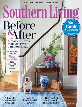
 This magazine has a neutral color scheme and an accent of blue throughout the title page. The title of the cover is also in a royal blue, similar to the accent color of blue that can be found on the rest of the page. The ads in this magazine are for travel destinations, furniture and clothing. The circulation of this magazine was 112,065. The viewers of this magazine was a higher percentage of female and a low percentage of male. This can be a reason for the types of ads in which they are putting in this magazine. For the digital usage of this magazine, their amount of visitors on the page was 800,529 per month. Similar to the print version, the female percentage heavily out weighs the male percentage of viewers. People who want to view this magazine look for luxurious ways to style their home.
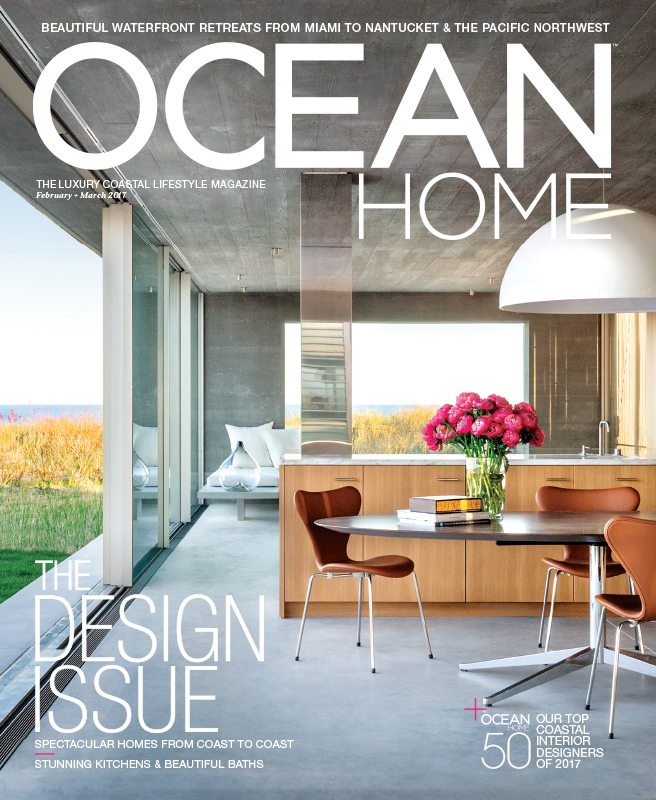 This cover is similar to other magazines. It has a neutral color scheme with an accent color somewhere incorporated to the image on the cover. Unlike other magazines, the title color is white, not the accent color. The article titles from the issue are near the edges of the magazine, not covering up the main image. Above the title, there is a description of what is included in the magazine. The word "Ocean" is bold in the title. This may be to emphasize the fact that this magazine is about the interior of homes that are specifically on the beach. The articles within this issue are about interior designing for houses near the ocean. The average age of audience is 51, with a majority of the audience being females. Most ads being included in the magazine are luxury vacation spot and high-net wealth products. The total national audience is 135,000 people.
 The cover to this magazine is more basic than the other ones. There is no article titles around the cover, but just the title. The title of the magazine is in an orange. You can see pops of orange around the cover. The one thing that the cover does say is "New york in living color" This suggests to the reader that the magazine will show examples of interior design in New York. The print audience for interior design is more than 62,000. The ads on the magazine are filtered towards female including clothes, makeup or travel destinations.
 This cover has a color scheme of black and an accent color of green. Most of the colors on the cover and a type of black. There is a couple of apples and plants on the table that are a type of green. The color of the apples are the color of the title and the articles are a shade of the green. This ties in the colors together and makes it look pleasing to the eye. In this issue, there are few articles. The main article of the issue is the largest article heading with two sub articles in smaller font. The types of ads in the magazine are filtered towards feminine viewers. There are more ads about clothes or vacation spots. This is because the target population of these magazines are more towards woman compared to men. The articles themselves are a few pages long. Between the articles, there are ads. Home and design distributes around 70,000 copies bi-monthly.